


Clinton’s political adviser Carville once said: ‘‘I used to think that if there was reincarnation, I wanted to come back as the president or the pope.
But now I would like to come back as the bond market. You can intimidate everybody.’’
At the end of 1994, 10-year Treasury yields climbed over 8% in response to increasing US fiscal deficits. The Clinton administration made an effort to reduce deficit spending, and yields dropped to around 4% by November 1998.
Around that time, Carville went public with the iconic statement you read above.
But if outright yield levels can intimidate everybody, yield curve inversions can literally terrify entire economies and financial markets.
An inverted yield curve not only predicts, but it directly contributes to sharp economic slowdowns: as refinancing credit short-term becomes prohibitively expensive while markets already price in poor expectations for long-term growth, the economic engine actually slows down and a vicious circle unfolds.
Today, we will talk about which yield curve to look at, why it’s very likely to invert and what does this mean for markets and the economy.

Without further ado, let’s jump right in!
Why The Yield Curve Will Invert
Let’s start from why I think the yield curve will invert.
Upward sloping yield curves are generally associated with markets expecting a healthy expansion down the road: why?

An upward slope implies that short-term borrowing costs are low enough to ensure decent long-term nominal growth.
Also, in this macro backdrop investors demand a higher compensation for holding riskier long-term bonds rather than simply rolling over the ownership of short-term bills - that compensation is called term premium (more here).
Today though, the macro environment doesn’t fit the picture above - quite the opposite actually: I argue the yield curve is likely to invert soon.

Starting in summer 2021, the yield curve has been flattening at a quick pace reflecting a slowdown in growth impulse and the Fed marginally tightening their stance.
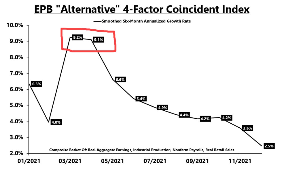
The slowdown in growth impulse is well captured in this chart from the excellent Eric Basmajian, which shows the 6m annualized growth rate of a basket of four relevant US economic indicators.
The peak in growth impulse was in May 2021.
At the January FOMC press conference though, Chair Powell went a step further: he didn’t do anything to remove the most hawkish Fed tail risks (e.g. 50 bps hike in March, hiking at every meeting etc) despite the slowdown in economic data being even more evident than before.
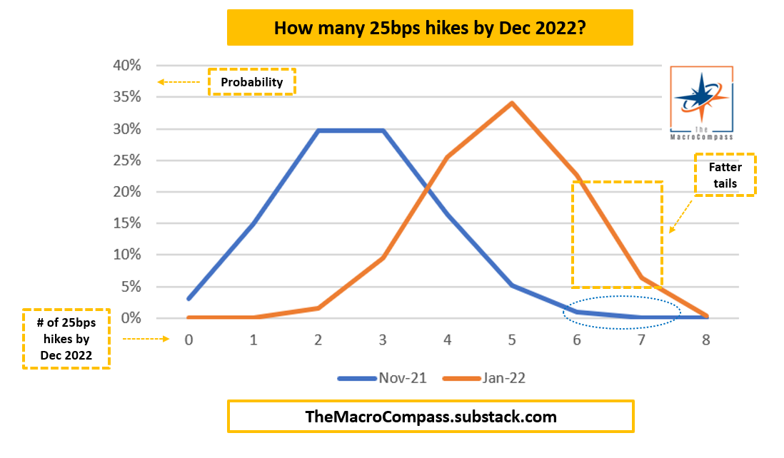
The chart above shows how the probability distribution for Fed’s monetary policy actions in 2022 has not only shifted to the right after Powell’s press conference, but it also has a fatter right (hawkish) tail compared to the end of 2021.
The fixed income market now prices a cumulative 30% chance the Fed will hike 6 or more times (!) in 2022 - as Powell validated this as a non-remote possibility.
By saying ‘‘there is quite a bit of room to raise rates without hurting the labor market’’ and ‘‘tighter financial conditions don’t matter until they threaten our dual mandate’’, Chair Powell gave markets the green light to price a more aggressive tightening stance and hence higher front-end bond yields.
For the curve to invert though, long-end yields also matter: what about them?
Long-end bond yields = long-term nominal growth + term premium.
Poor demographics and stagnant productivity trends already weigh on long-term nominal growth prospects. On top, since summer 2021 we are witnessing a cyclical slowdown in growth impulse and now the Fed is on a mission to tighten financial conditions and increase short-term borrowing costs for the private sector: prospects for future nominal growth aren’t looking great.
Also, term premium is unlikely to increase: the uncertainty around future growth outcomes is not that high (it will suck) and hence the marginal compensation investors require to own long-term bonds in such a macro backdrop is pretty low.
Basically, long-end bond yields are going nowhere (or lower) while short-end bond yields shoot up to reprice an incrementally more aggressive Fed tightening cycle.
Up to the point when the yield curve inverts.
Ok, But What Yield Curve?
Yes, but what yield curve exactly?
The OIS swap curve - I like to look at the 5y-30y slope in this curve.
I know, it sounds complicated but it’s not: bear with me.

Most financial commentators look at various slopes in the Treasury yield curve to determine whether it’s inverted or not, but that’s not the correct way to do this.
Investors buying bonds are compensated with a bond yield that should cover both interest rate risk and credit risk.
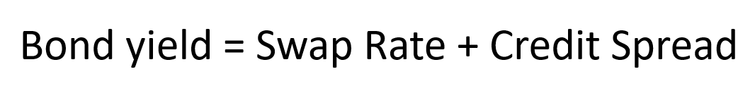
A common mistake is to include the credit spread component in the assessment of yield curve slopes - it unnecessarily pollutes the analysis.
Instead, our focus should be on what market participants expect for the short-term and long-term path of the purest risk-free rates instrument: Fed Funds rates.
OIS stands for overnight index swaps and they are are perfect for that.
For instance: in a 5y US OIS swap, you receive a fixed 5y rate in exchange for paying the overnight Fed Funds rate on a daily basis over the next 5 years.
Basically, OIS swaps tell you where the fixed income market consensus expects Fed Funds rates to move over a fixed period of time (more here).
And yes, I am telling you Treasury bonds trade at a (credit) spread to OIS swaps - I will cover this and other topics in depth in a Bond Market 101 article.
I use the 5y-30y slope: the average length of a Fed tightening cycle tends to be historically around 3-5 years, while 30y yields reflect long-term expectations for nominal growth and term premium.
Here is how it looks like.
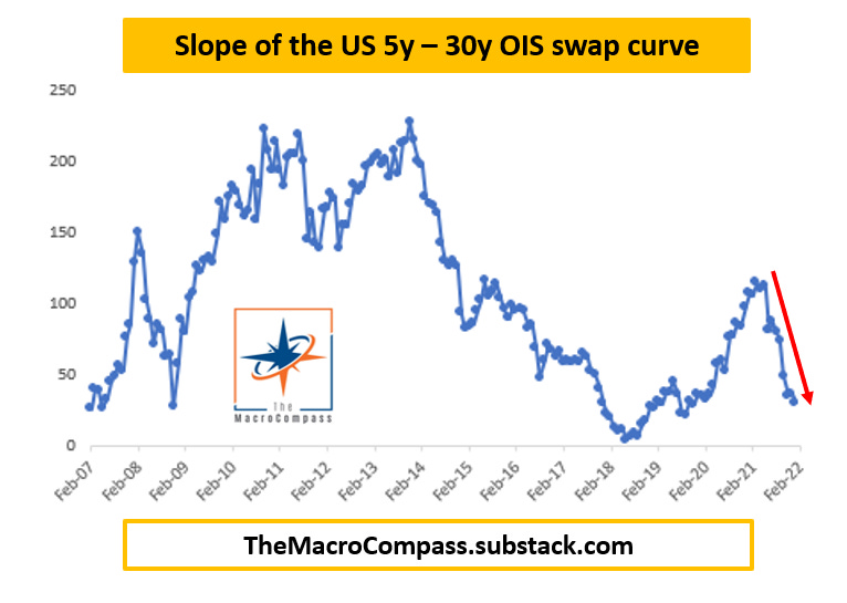
It’s now at 16 bps only (spoiler: the same slope on the Treasury yield curve would say we are ‘‘still’’ at 46 bps, quite a ‘‘healthy buffer’’ if you don’t look at the right curve).
OIS swap rates are not easy to find online unless you have an expensive Bloomberg terminal - but don’t worry: you can follow me on Twitter for regular updates.
By The Way, Who Cares?
Cool, now you know why I expect what yield curve to invert.
But who cares about yield curve inversions? Well, you should.
Inverted yield curves not only predict sharp economic slowdowns, but they also actively contribute to them.
Unfortunately, my OIS swap data goes back only to 2011.
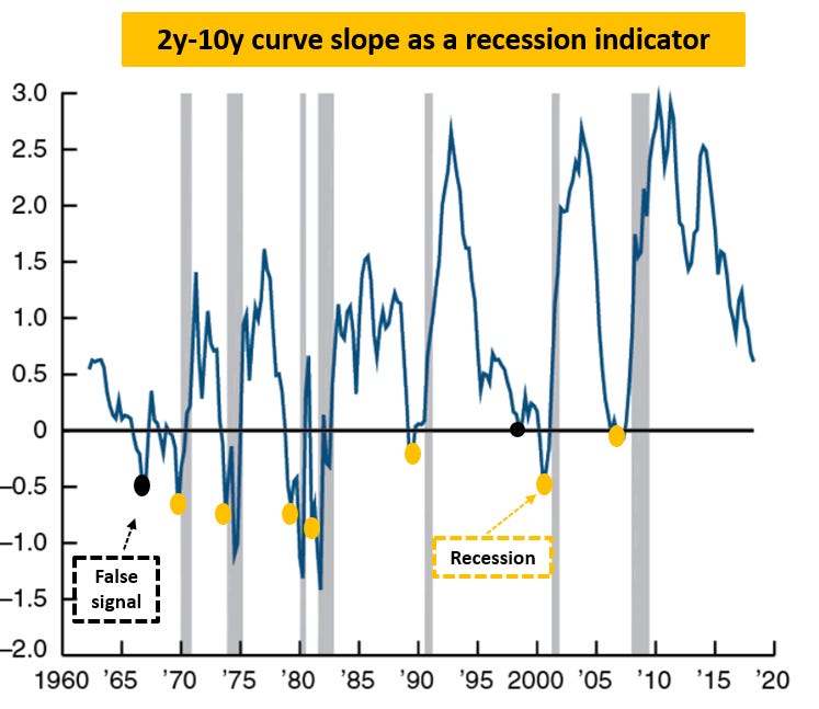
For a more historical overview, we need to use the ‘‘credit spread polluted’’ Treasury yields, and the best way to reduce this pollution is to use the 2y-10y slope as long-end Treasury credit spreads tend to be the heaviest across the curve.
The Chicago Fed shows a very famous relationship: inversions in the 2y-10y slope of the Treasury yield curve is a solid indicator of sharp economic slowdowns ahead.
I am going to go a step further here and briefly explain why an inverted yield curve actually contributes to the slowdown, rather than only predicting it.
As explained here, we often overlay cyclical growth to the poor structural growth trends using leverage - this ‘‘kick-the-can-down-the-road’’ system is sustainable only if (real) borrowing costs are cheaper and cheaper to facilitate refinancing and marginal access to new credit.
When the yield curve is inverted, the marginal cost of refinancing and accessing new credit short-term increases and often breaches the equilibrium levels required to keep the system afloat - this increases the hurdle for the private sector to access credit.
As long-term growth prospects are poor, an already indebted private sector looking at more expensive borrowing costs might even think of the ‘‘true evil’’ - deleveraging.
A vicious circle therefore unfolds: restricted/more expensive access to credit in an already slowing and poor long-term growth environment leads the private sector to be more defensive, which compounds on the already ongoing cyclical slowdown.
An inverted curve doesn’t only predict slowdowns, but it often contributes to them.
Conclusion
When it comes to inversions, the right yield curve to look at is the Overnight Index Swaps (OIS) curve as it doesn’t pollute the analysis with credit spreads.
The slope of the 5y-30y OIS curve is likely to invert soon.
Today, it trades at a meagre 16 bps and Powell didn’t remove the hawkish Fed tail risks (e.g. 50 bps hike in March or hiking at every meeting) and validated the aggressive hiking cycle pricing amidst a clear slowdown in economic growth impulse.
This matters a lot, as yield curve inversions not only predict but they actually contribute to sharp economic slowdowns: as refinancing credit becomes prohibitively expensive today while markets already price in poor expectations for long-term growth, the economic engine actually slows down and a vicious circle unfolds.
If you enjoy my work, please consider clicking on the like button and share the article.
It costs you literally nothing, but it would really make my day!
Are you looking for any other kind of partnership or collaboration?
Are you an institutional investor who likes The Macro Compass and would be interested in a bespoke, pro-to-pro coverage?
Feel free to get in touch at themacrocompass@gmail.com.

See you again on Monday!


The Yield Curve Inversion is Coming