


Investing in 2022? It's like a mid-2018 flashback!
TMC#18! 2022 looks a lot like summer 2018: portfolio returns adjusted for inflation are likely to be poor across the board but few investments might still work.
15’ reading time
‘‘History doesn't repeat itself, but it often rhymes: the asset classes that worked in summer 2018 are likely to do the trick for your portfolio also in 2022’’ (Mark Twain)
Good morning to the 10.5k+ subscribers and a special welcome to the +1625 nice people that have decided to sign up to The Macro Compass last week!
Are you looking for a partnership or a collaboration? Feel free to get in touch at themacrocompass@gmail.com.

In this article, we will discuss the eerie similarities between the macro environment we face going into 2022 and the one we experienced around mid-2018.
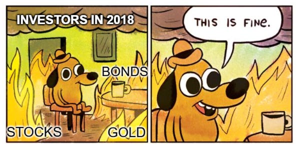
We all know that real asset returns in 2018 proved to be pretty poor regardless of your portfolio allocation, and that’s scary - will 2022 provide us with a similar macro backdrop? What are the main differences instead, and how can we expect different asset classes to behave?
Let’s dive right in!

2022 = summer 2018, and why it matters
My base case scenario is that the 2022 macro framework looks an awful lot like the summer 2018 one. That’s a relatively scary proposition though, let’s see why.
The table below shows the total returns of different asset classes throughout the years: can you spot 2018?
A sea of red.

Now, those are nominal returns - but if you care about preserving the purchasing power of your savings, what really matters is inflation-adjusted returns.
In 2018, YoY CPI was +2% in the US and +1.5% in EU.
That means basically ALL asset classes delivered negative real returns in 2018.
Scary.
Truth be told, most of the negative market performance across asset classes occurred between October and December 2018, while my base case is that we are now experiencing a market/macro phase similar to summer 2018.
Let’s see why.
The credit impulse trends look very similar
The labor market is in a mature healing phase, like in mid-2018
Central banks have turned more hawkish too!
By now, I guess you all know that my prop G5 Credit Impulse metric leads economic activity and asset class returns with a 6-12 months lag (if you don’t, check out the article below).

So, what will be relevant for economic activity and portfolio returns in 2022 are the developments in credit creation during 2021 and early next year - for our 2018 reference period, that would have been the credit impulse during 2017 and early 2018.
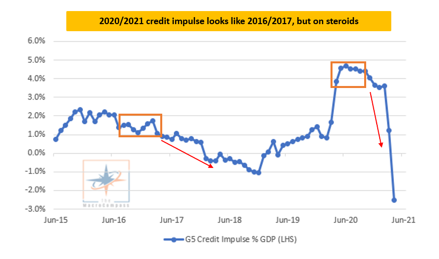
The chart above shows a similar credit impulse pattern, but on steroids.
After the 2016 China-driven strong credit impulse data, the credit creation process stalled for 10 months at around 1% of global GDP and started dropping slowly but surely after the second half of 2017.
Fast forward to today, the trend looks like a turbo-charged version of the above.
As the result of a globally concerted fiscal effort and government guaranteed bank lending activity, the G5 Credit Impulse skyrocketed in 2020 but then stalled for 4-5 months into Q121 and started dropping very quickly in summer this year.
Ok, we get it: as we head into 2022, global growth looks toppish similar to mid-2018.
Any other similarities?
Oh, yes: the labor market is healing, and central banks reaction function has become more hawkish.

The chart above attempts at capturing the big picture dynamics of the US labor market in mid-2018 vs today by displaying the broader measure of unemployment rate U6 and the 6-months moving average in US non-farm payrolls.
The top section of the charts shows how the US labor market healing process was entering its mature phase in mid-2018: U6 was still mildly falling (good!) and the pace of the 6m moving average in NFP was stable in the 200k area (nice!), but the job market animal spirits had begun to fade away a bit.
Fast forward to today, U6 is still falling and the pace of the 6m moving average in non-farm payrolls is still very robust but we are getting the first signs we might be entering the mature phase of the cyclical labor market healing process in 2022.
To be clear, you should expect the labor market to perform well and keep healing in 2022 but at a slower pace than 2021 - a more mature phase, basically.
Why is this similarity relevant?
Because it gives green light to the Fed to remove accommodation in a more confident manner.
Policymakers are conservative in nature: they strive to preserve the status quo (which keeps them in power) and tend to act only when tons of evidence has confirmed their stance over time.
Central bankers watching a 7-10% YoY nominal GDP growth in 2021, a healing labor market going into 2022 and inflation persistently above their targets will be very enticed to act - the risk/reward of not doing so looks very poor, all of a sudden.
But Alf, you just told me that the cyclical growth impulse and the pace of the labor market improvements are likely to slow down in 2022: are they really going to tighten monetary policy on that backdrop?
Yes, and that’s why yield curves have been flattening aggressively.

Ok, so basically it’s summer 2018 again, right?

Is there anything suggesting 2022 ≠ mid-2018?
Yes: both fixed income investors and the Fed have become a bit more realistic about the fragility of the system vis-à-vis 2018.
Have a look at the chart below: it shows how market participants are pricing where 5y forward, 5y real interest rates will be against my estimate for the real equilibrium interest rate in the US.

In 2018, observed real yields started quickly converging on the upside with the equilibrium levels the economy can withstand - and we all know what happened in Q418 and how Powell had to pivot in 2019.
Today, 5y5y real yields trade at -1% against my estimate for the equilibrium US real interest rates being slightly above 0%: that’s quite a buffer, and the direction of travel of real yields hasn’t even moved upwards convincingly yet.

Also, FOMC members have not even attempted at moving their ‘‘long-run dot’’ higher as they did during 2018 when they signaled strong confidence in a prolonged hiking cycle (‘‘we are still far away from neutral’’).
Today’s long-run dot sits at 2.50% (50 bps below 2018) and the Fed is not even hinting it might be higher - for context, the bond market thinks the terminal point of the Fed hiking cycle this time will be < 1.75%.
Hence, it seems that both central bankers and fixed income investors are slightly more realistic today about the equilibrium rates that hold this fragile system together than they were in 2018.
So, what’s the take here?
Today’s environment presents scary similarities with the summer of 2018 - central banks are about to tighten on a backdrop of fading growth impulse and a maturing phase of the labor market cyclical healing process.
On the other hand, the bond market and the Fed are more realistic about how a credible hiking cycle looks like today against 2018 - terminal rates and forward real yields are less ‘‘enthusiastic’’ today than they were in 2018.
If we look at the 2018 period ranging from mid-June to mid-October and we use that as a reference, we see the following:

The S&P500 and the Nasdaq were amongst the few asset classes that delivered a positive total return, but the Russell index couldn’t keep up
Emerging market equities took a pretty large hit, as did Copper (here used as the proxy for industrial commodities)
The yield curve flattened and 7-10y yields moved up a bit, with credit spreads underperforming (BTP/Bund 51 bps wider)
The USD appreciated against both the EUR and BRL (proxy for EM FX). It also appreciated against Gold and Bitcoin
The last few months in markets have been pretty much following similar trends, and my macro analysis seem to back this narrative so far.
Remember: deal with the hand you’ve been dealt with, and not with the one you wish you had.
We are now a 10.500+ community here on The Macro Compass. Thank you!
If you’d like to receive updates directly in your inbox, you can subscribe clicking on the button below.

Are you looking for a partnership or a collaboration? Feel free to get in touch at themacrocompass@gmail.com.
I will publish a new article covering market/economics developments and providing investment ideas every week on Monday, and a more thematic/evergreen edition of the newsletter two Thursdays per month.
From the desk of a former Head of a $20 bn Investment Portfolio straight into your inbox. And the best part of it: for free!
See you at the next update!
Hi Alf, your analogy to 2018 could indeed be a real scenario, I agree. But somehow only the second half of 2022 ? The economy still appears strong enough (structurally, with pent-up demand etc.) to be able to absorb a large part of the tightening in my view. Structurally, the US household, corporate and banking sector are all strong. That suggests an ability for the economy to absorb higher interest rates. If correct, then real bond yields (and indeed much of the interest rate structure) should move higher which, given those high stand-alone valuations, at some point (2H 2022?), will create significant challenges for the stock market.
Awesome read and great interview on Real Vision recently Alf! You should also note that the Eurodollars futures curves inverted (currently!) and they also did so in 2018. The Eurodollar system is clearing pricing in deflation/disinflation/risk off which is consistent with your Macro Compass take on the global credit impulse (what I call BOMD = Bank Originated Money and Debt).