


Hi all, and welcome back on The Macro Compass!
Quick reminder: from January 1st, getting access to this content (and much more!) will require a paid subscription.
The exclusive offer to get in by paying 9 months instead of 12 runs until December 10 (only 6 days left), and spots are limited.
If you find value in these macro strategy pieces, you are going to love the enhanced TMC products in 2023 - check out which subscription tier suits you the most and take advantage of this exclusive offer!
The Labor Market Holds The Key
Especially at turning points, looking beyond the main headlines in macro data can make the difference in understanding where do we really stand in the macro cycle.
The last US payroll report was tagged as very strong - but if you look deeper you realize the current state of the US labor market is far from ‘‘hot’’.
Job creation is clearly trending down, alternative real-time and forward-looking labor market indicators point to a sharp deterioration ahead and statistical inconsistencies are artificially boosting non-farm payrolls to the point the US government reached out to ask if I could help them look into it.
The labor market holds the key to the Fed reaction function in 2023, and hence it will be a crucial driver of asset classes performance - calling it right can make the difference for portfolios next year.
In this article, we will:
Dissect the latest labor market report, starting from a deep look into the BLS official data and moving into alternative real-time and forward-looking job market indicators to grasp where do we really stand;
Assess what that implies for the Fed policy and portfolios in early 2023.

The Devil Is In The Details
The labor market is much less hot than you think.
Let’s get one thing straight though: we are not in a recession yet.
Job losses aren’t here, and nominal wages are still growing at a robust pace.
But the labor market is clearly deteriorating fast: its current state is far from the ‘‘very tight’’ definitions we often hear, and looking forward it might get real ugly.
Let’s start from a thorough assessment of the official Bureau of Labor Statistics (BLS) latest data on the Non-Farm Payrolls (NFP) released on Friday.
#1: The NFP Report: Doing Okaysh, But…
Non-Farm Payrolls beat expectations, we had small net positive revisions and nominal wage growth surprised on the upside - it must be hot, right?
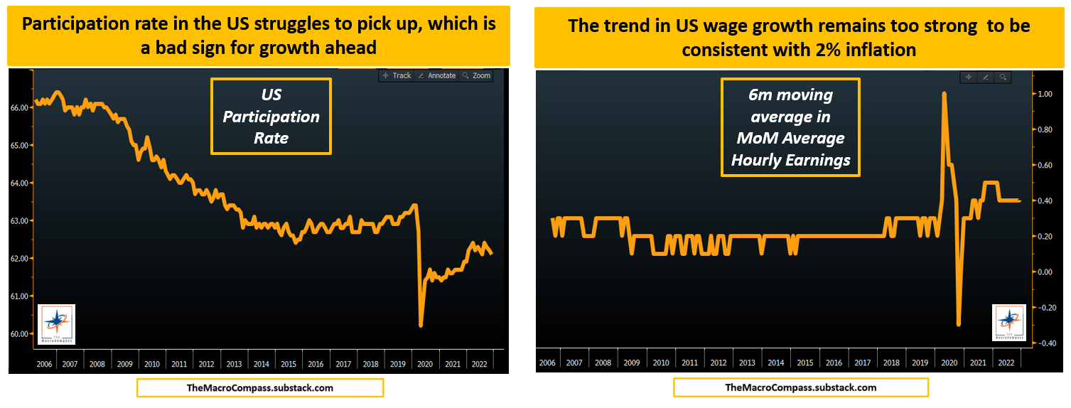
I can definitely agree that US wage growth remains way too strong to be achieve 2% inflation - right now, it’s rather consistent with 4.0-4.5% core CPI.
But nominal wages are possibly the most lagging macro cycle indicator of them all.
For them to drop, you need: forward-looking growth down, activity down, companies cutting discretionary spending, consumption down, companies cutting capex and excess labor, activity down further, companies cutting core labor…and finally you’ll see nominal wages trending down as demand/supply in the job market rebalances.
And on top of it, one reason why nominal wages might remain strong is a stubbornly low participation rate: and while it’s true that less supply of labor coming back online means more wage bargaining power, it also means less people are actively contributing to economic growth.
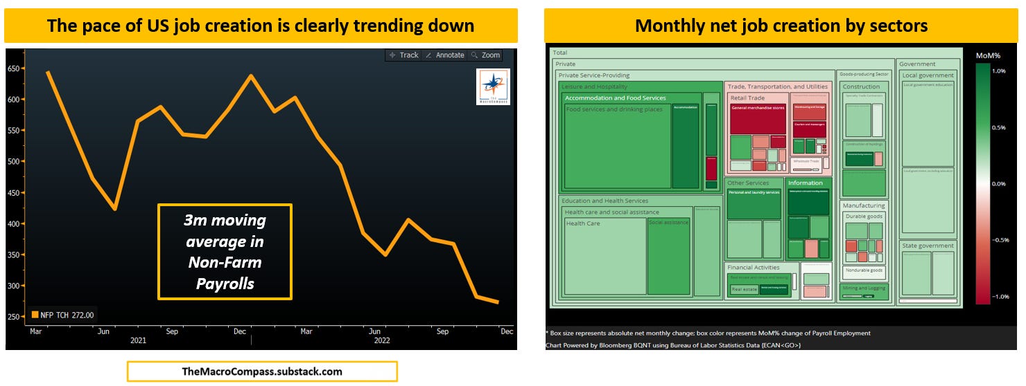
Focusing on the momentum of job creation and where these jobs are actually created tends to be a more useful forward-looking macro exercise than focusing on wages.
The 3-month moving average of US NFPs is clearly trending down and in November the BLS reported most jobs were created in leisure&hospitality, education, healthcare and government.
Accommodation and food services are still playing catch-up with the pandemic disruptions, and job creation in the government/education sectors are not necessarily a sign of strong economic activity.
The fact that economic-sensitive sectors like retail trade, transportation, manufacturing and some areas of housing-related jobs are all showing weakness is very telling - they move first, and they are clearly showing the direction ahead.
Now, the elephant in the room: there are some material methodological and statistical issues with the current BLS establishment survey, and hence the NFP numbers might well be…almost totally off.
Let’s see why.
#2: The Household Survey vs The BLS Establishment Report
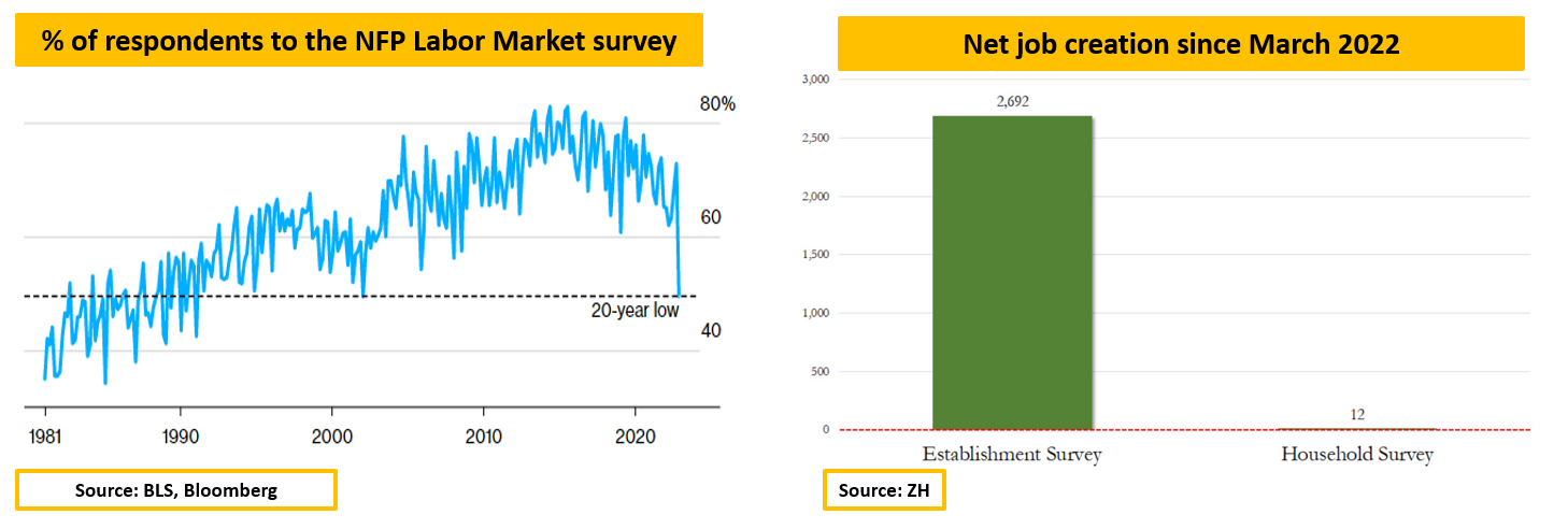
A statistically significant survey requires a very large amount of respondents.
Well, the last NFP Establishment survey got the lowest response (49%) in 20 years.
Luckily, we can benchmark the NFP survey with another regular job market gauge which is the Household survey.
There are three main differences between the two surveys:
The NFP survey asks businesses and government agencies about job creation; the Household survey asks households;
Multiple jobholders are counted for each (!) nonfarm payroll job in the NFP, while in the Household survey multiple jobholders are counted only once;
The NFP surveys makes large use of statistical adjustments (e.g. net business birth/death adjustment) while the Household survey doesn’t.
According to the Household survey, literally almost zero net jobs have been created since March against the 2.7 million jobs reported by the NFP Establishment survey.
What?!
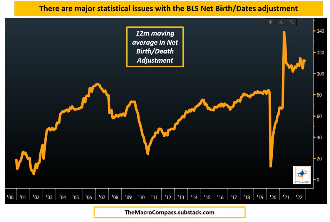
As said above, statistical adjustments abound in the Establishment NFP survey and they might have been very relevant in November given the low actual response rate.
The BLS estimates how many new business have been created on a net basis and adds the resulting estimated net new job creation to the NFP numbers every month.
As recognized by the BLS itself, the pandemic has created major disruptions to their statistical methodologies which now keeps showing an amount of new net business creation roughly double (!) the pre-pandemic level.
This might be a strong artificial boost to NFP numbers, and explain a lot of the difference with the much weaker Household figures.
So, how do we get a cleaner reading of the real state of the US job market?
A good gauge for the current state of the US labor market is the pace of full-time hirings (excluding multiple jobholders).
On a rolling 6-month % change basis, the momentum in US full-time hiring is basically flat and in line with the weakest prints (ex-pandemic) of the last 10 years.
Real-time alternative data can also be very helpful: for instance, LinkedIn collects data on its members (users and companies) adding new jobs to their profile and puts them into a hiring rate index.
It shows the pace of US hiring is down 20%+ from last year.

By now, we have established that the US job market is not as hot as many people think.
Actually, it’s weakening pretty fast.
The real question is what lies ahead for Q12023, and how to prepare portfolios for it?
Conclusions & Portfolio Implications
Robust forward-looking indicators are very useful in macro asset allocation because they tend to paint a good picture of what lies ahead for the main market drivers: growth, inflation and Central Banks.
Of the many we track at The Macro Compass, I chose the US Financial Conditions (orange line, inverted on the right-hand side) against the year-on-year NFPs (blue, left-hand side).
Notice how rapid changes in US Financial Conditions lead job creation trends by 9 months: why?
Because once equity valuations and borrowing costs deteriorate - or in other words financial conditions tighten - companies first cut discretionary spending, then proceed towards hiring freezes and only later on they start cutting labor.
It takes a few quarters for tighter financial conditions to hit the labor market.
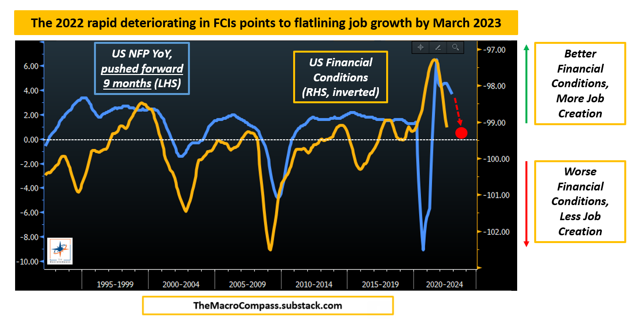
Yet, right now it’s only a matter of when and not if.
And my models are pointing to zero or negative job creation by late Q1 2023.
In other words:

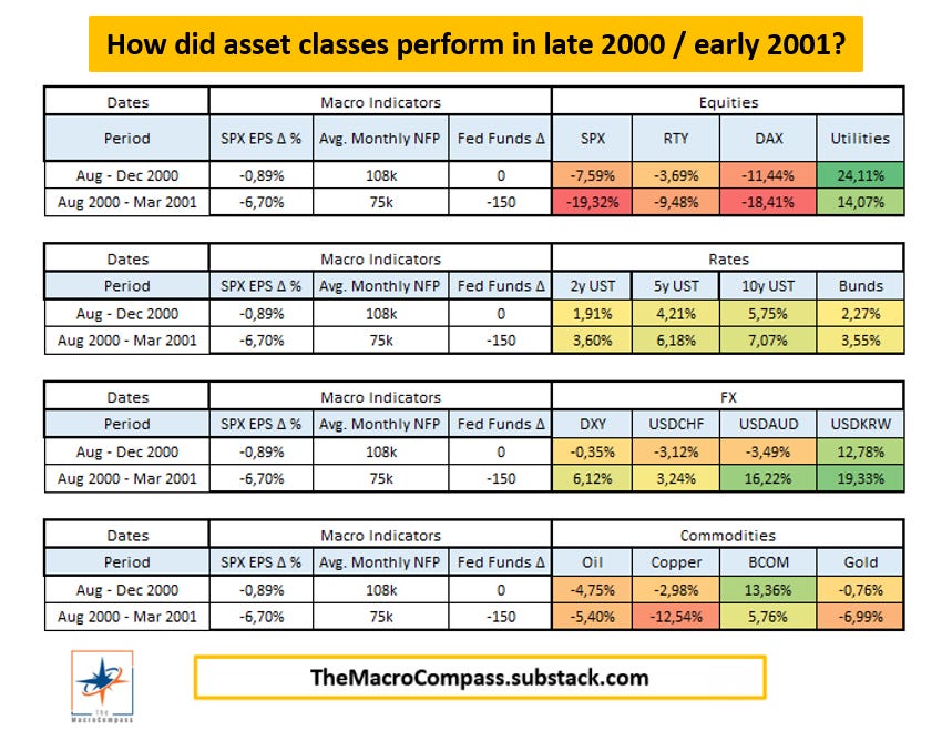
If we should expect labor growth to gradually slow down to 0%, how do asset classes historically perform in this transition period towards a recession - which is my base case for Q2-2023?
Late 2000/Early 2001 is amongst the best historical parallels for the period ahead, followed by late 2007/early 2008.
In both cases:
Equity indexes dropped an additional ~10%, but defensive sectors (e.g. utilities, consumer staples, healthcare) held up much better;
The US Dollar did well in 2001 despite the Fed cutting rates, while it underperformed in early 2008 as the US housing market crisis unfolded;
Commodities and precious metals performance was mixed;
Government bonds delivered a meaningful positive performance for portfolios in both cases
My base case is that the labor market will materially weaken and lead us into a serious recession.
Historically, recessions have always caused inflation to cyclically drop like a stone and this time won’t be different.
This will force the Fed to cut rates aggressively in the second half of 2023, and ultimately to bring them in the 1-2% area by early 2024.
That’s a proper pivot.
But a Fed pivot because of a bad recession is not bullish risk assets.
Subscribers to The Macro Compass paid premium products: stay tuned for my detailed ETF portfolio and Tactical Trade Ideas to be released in January!
And this was it for today, thanks for reading!
If you enjoyed the piece, please click on the like button and share it with friends :)
Finally, a quick reminder: from January 1st, getting access to this content (and much more!) will require a paid subscription.
As a loyal TMC reader, you have one last chance to get in with an early bird discount: until December 10th, you can get in by paying 9 months instead of 12 and ensure access to TMC content for the entire 2023.
The offer only runs for another 6 days and spots are limited.
Check out which subscription tier suits you the most and grab your last chance to take advantage of this exclusive offer - the discount code is ‘‘TMC2’’!
Subscribing to any of the tiers above now will guarantee you lock-in early bird prices and your subscription will cover the entire 2023 calendar year.
For more information, here is the website.
I hope to see you onboard!
DISCLAIMER
The content provided on The Macro Compass newsletter is for general information purposes only. No information, materials, services, and other content provided in this post constitute solicitation, recommendation, endorsement or any financial, investment, or other advice. Seek independent professional consultation in the form of legal, financial, and fiscal advice before making any investment decision. Always perform your own due diligence.


You Think The Labor Market Is Hot? Think Again