
The big Central Bank week is here: ECB, BoJ, Fed…wow!
Well…if you are an institutional investor who enjoys my macro analysis, I have great news for you!
I just launched a live Bloomberg chat service and institutional research service dedicated to you!
I'll cover macro, Central Bank and market events daily through an interactive BBG chat and deliver institutional-focused macro research pieces - ping me on Bloomberg (Alfonso Peccatiello) or email at pro@themacrocompass.com for a 2-weeks FREE trial!
Yes: it costs you nothing to try!
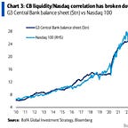
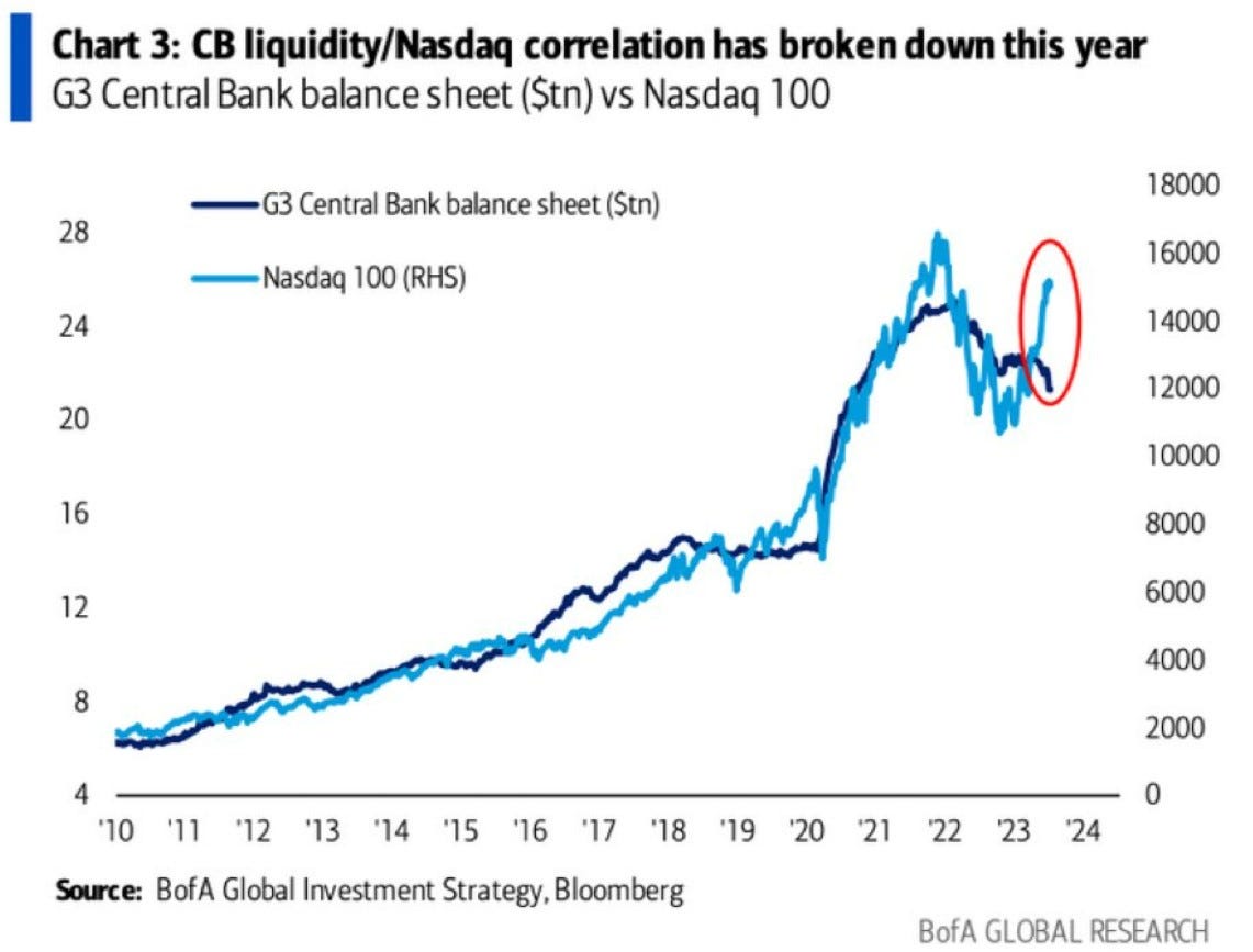
This is one of the most popular and yet misleading charts in macro.
People like simple narratives: the Fed is ''pumping money'' into the ''system'' and that's why equity markets go up.
That’s just NOT how it works - let’s explain why.
A good starting point is asking ourselves what’s ‘‘money’’ and what’s the ‘‘system’’.
Let’s start from money.
Central Banks' balance sheets expand mostly through monetary operations: the most known is QE, but there are also other tools like the recently created Fed's BTFP.
In any case, when the CB expands its balance sheet by acquiring assets (QE) or providing financing in exchange of collateral (e.g. BTFP, TLTRO) it also expands the liability side - it prints ''money'', but to be more precise it prints bank reserves.
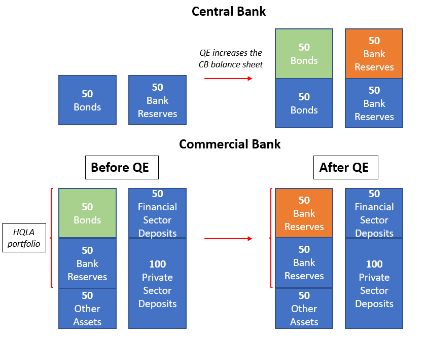
Bank reserves are bank-money, not real-economy money: only banks can transact in bank reserves with each others, and these reserves can never (I repeat, never) reach the private sector.
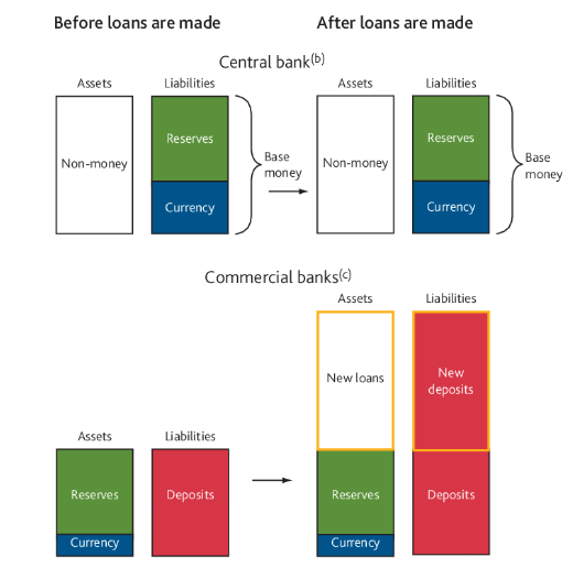
No: banks don't ''multiply'' reserves when they make loans.
As the Bank of England shows, banks create new money when extending credit to the private sector and they do not ‘‘transform’’ existing reserves.
But most importantly, no: banks don't buy stocks (!) with newly printed bank reserves!
The idea behind this chart is just wrong: as the Fed creates new bank reserves (''liquidity'') there would be a mechanism for which banks deploy these reserves in financial assets hence pushing equity markets up.
But banks don't do that.
What are reserves used for?
Mostly to settle transactions against other banks.
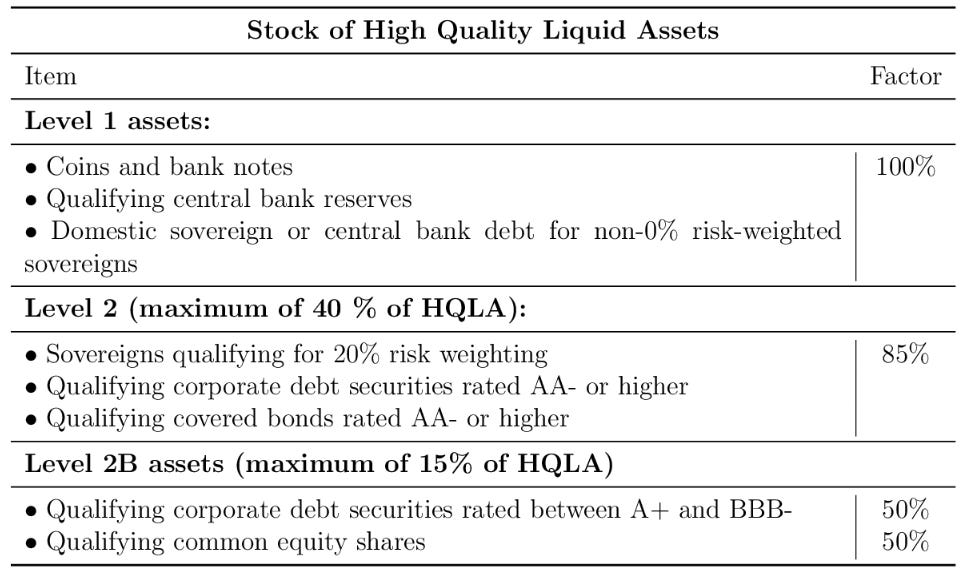
They also account as a High Quality Liquid Asset (HQLA) together with government bonds and certain corporate and mortgage-backed securities: banks can use them to pay other banks if they buy HQLA assets from those, passing over bank reserves in a closed system like a hot potato.
But they won't use reserves to buy stocks - they are effectively not eligible as a HQLA asset or only under extremely strict conditions.
Equity ownership as a % of HQLA buffers from big European and US banks is negligible - conditions are so strict you could say it’s almost 0%.
I know what you are thinking now: the portfolio rebalancing effect.
If banks are bidding corporate bonds away from each other's HQLA buffers, spreads will tighten and this should invite a more aggressive stance from equity investors too.
That's partially true, but it's a potential second-order effect which also requires fundamentals (!) to back the thesis: banks aren't gonna blindly over-allocate to corporate bonds because they have more reserves if they smell the risk of rising defaults.
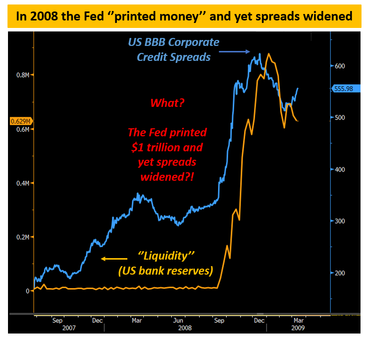
See what happened in 2008: the Fed ‘‘printed’’ almost $1 trillion (orange) very rapidly and yet corporate credit spreads (blue) kept widening as default risks were increasing due to the Great Financial Crisis.
Economic conditions matter after all.
Which brings me to the main point why the original chart in this piece is misleading.

These two series trended up over the last 15 years for different reasons: Central Banks kept accommodating through QE & Co to bring inflation back to target and most importantly...
...the Nasdaq went consistently up also because earnings grew by roughly 10% on average per year (!!!).
Don’t believe me yet?
Let’s do some basic math together.
Is it really true that ‘’liquidity’’ is so tightly correlated to stock market returns?
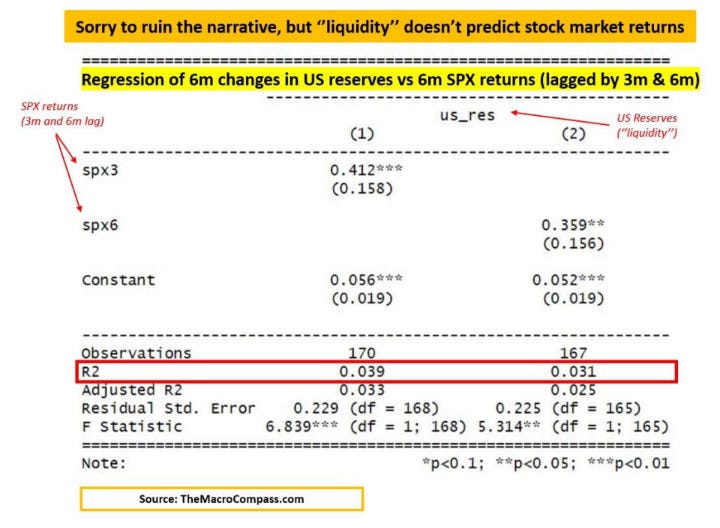
We ran a simple linear regression analysis between the change in ‘’liquidity’’ (US bank reserves) and the S&P500 returns in the last 15 years – we played around with time lags, outliers, return windows...everything.
Bank reserves and stock markets both tend to go up over time and hence they look ‘’correlated’’, but analysing the rate of change of liquidity and S&P 500 returns helps with smoothing this problem away.
The result was consistently clear.
A simple linear regression exercise tells us ‘’liquidity’’ is pretty bad at predicting stock market returns: as shown by the R2 data, in the last 15 years US liquidity only explained 3-4% (!) of the variation of SPX returns.
So, yes: both series trended up over time and plotting them on a dual-axis chart looks great but stocks go up over time because earnings grow and not because Central Banks pump ''money'' in the ''system''.
Money in this case means bank reserves, and banks can’t and won’t use reserves to buy stocks - the direct relationship and simple narrative suggested by mainstream macro commentators…
…simply doesn’t exist.
The big Central Bank week is here: ECB, BoJ, Fed…wow!
Well…if you are an institutional investor who enjoys my macro analysis, I have great news for you!
I just launched a live Bloomberg chat service and institutional research service dedicated to you!
I'll cover macro, Central Bank and market events daily through an interactive BBG chat and deliver institutional-focused macro research pieces - ping me on Bloomberg (Alfonso Peccatiello) or email at pro@themacrocompass.com for a 2-weeks FREE trial!
Yes: it costs you nothing to try!


