Secular trends are back
TMC #10! Mr. Bond Market got louder last week: further unwinding of reflation trades and resumption of secular trends. Where do we stand on The Macro Compass?
Good morning everybody and welcome back to The Macro Compass!
Sorry for skipping the Thursday update, but I am on holidays. Pizza was calling.
Last week was pretty hectic in markets though, so I jumped on Real Vision to record my first video interview with them. We discussed how QE really works, the fallacy of the inflationary ‘‘regime change’’, global macro asset allocation and much more.
You can find it here.
Back to business now: what happened last week, what’s the Macro Compass telling us today and what next in global macro?
The Macro Compass
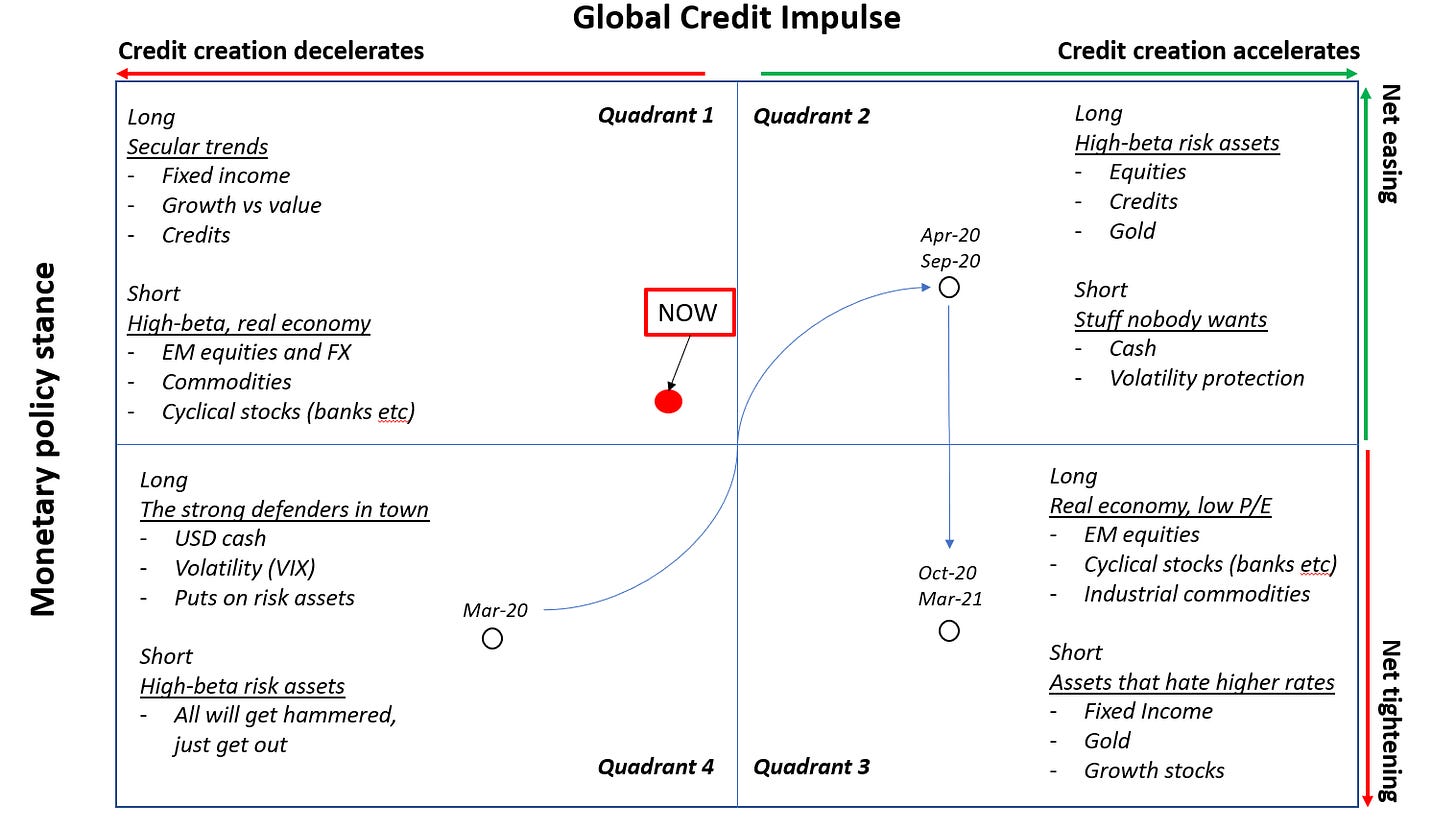
I’d argue we are now firmly in Quadrant 1, where most secular trends resume: long growth vs value, DM vs EM, long fixed income / short inflation break-evens, long gold versus copper etc.
The Fed’s reaction function to hard data and the pace of change in their monetary policy decisions is likely to dictate how often we are going to have quick peeks at Quadrant 4 (sell all risk assets, buy USD and VIX).
Let’s look a bit more into the Compass and where exactly do we stand today.
For the newcomers, The Macro Compass is the main tool I use to assess what could be the best risk/reward asset allocation mix at any point in the macro cycle.
The Macro Compass is influenced by 2 metrics: the G5 Credit Impulse and the relative monetary policy stance. As you move around the two axis, you will end up in one of the 4 quadrants. Each quadrant represents a certain macro environment and prescribes a specific asset allocation.
I described The Macro Compass in more details in this post. More than one month ago, it was already prescribing to steer clear from high-beta, real economy linked risk assets (e.g. industrial commodities, EM equities, cyclical stocks etc).
Given their relative underperformance in June and July so far, that wasn’t such a bad advice, was it?
Back then, I argued we were ready to move away from the right side towards the left side of the Compass as G5 Credit Impulse peaked in Q420 and it leads GDP and risk assets with a 8-12 months lag.
The G5 Credit Impulse represents the change in pace (e.g. acceleration) of credit creation in the 5 largest world economies. Credit creation feeds into real economic activity with a 6-12 months lag, leading GDP/earnings/inflationary pressures to pick-up and pushing high-beta, real economy linked risk assets to perform.
Once the credit impulse peaks and growth expectations are toppish (9-12m lag), the so-called ‘‘reflationary trades’’ tend to struggle.
That’s where we stand today: the left-side of the Compass.
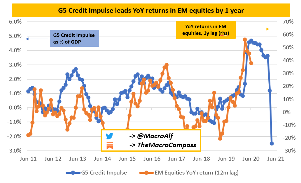
The graph above shows the YoY return of EM equities lagged by 12m versus the G5 Credit Impulse as % of GDP.
As the acceleration in credit creation goes up (blue line up), EM equities (orange line) generate decent returns with a 12m lag. And vice versa.
Cool, but Quadrant 1 or Quadrant 4 is a different ball game.
So, what about the relative monetary policy stance?
Mr. Bond Market is pretty clear: he prices in a relatively easy monetary policy stance.
The range of estimates for the real natural interest rate (r*) in the US stand between 0 and 0.5%. I concur with such estimates - labor supply is negative in the US, capital misallocation is all over the place, productivity is only mildly positive and the public + private debt/GDP is almost at 300%.
Assuming an achievable 2% trend inflation, the real Fed Fund rate today is -2%. Hardly a tight monetary policy stance.
Over the medium term, 5y forward 5y real interest rates as priced by the fixed income market stand well below 0%. Also here, hard to call this a tight stance.
Will the Fed listen? Their recent watered down commitment to flexible average inflation targeting and intensified tapering discussions are not promising from this perspective. On the other hand, they are well aware of their limits as their terminal rate on the dot plot is set at 2.5% (0.5% in real terms, approximately in line with r*).
In short, credit impulse has peaked and the market is paying attention by steering towards the left side of the Compass as expected. The relative monetary policy stance remains easy, and hence we sit in Quadrant 1.
The Fed’s reaction function to hard data will determine how often we will peek into Quadrant 4. We tried that very shortly last Thursday, didn’t we? Not really.
The bond market is doing the hard work
Most commentators would describe last week as a relative broad risk-off week.
I don’t think you can have a sustained risk-off unless inflation expectations fall sharply leading to real rates increase and USD rallies across the board.
None of that happened last week, mostly courtesy of the bond market.
Yes, inflation expectations fell.
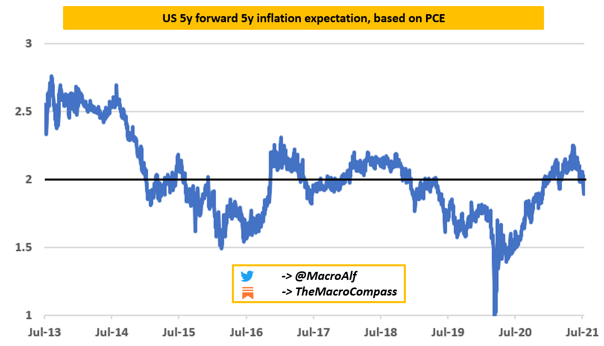
The chart below shows 5y5y inflation expectations based on PCE (the inflation indicator the Fed cares about). They dropped below 2% again last week, true.
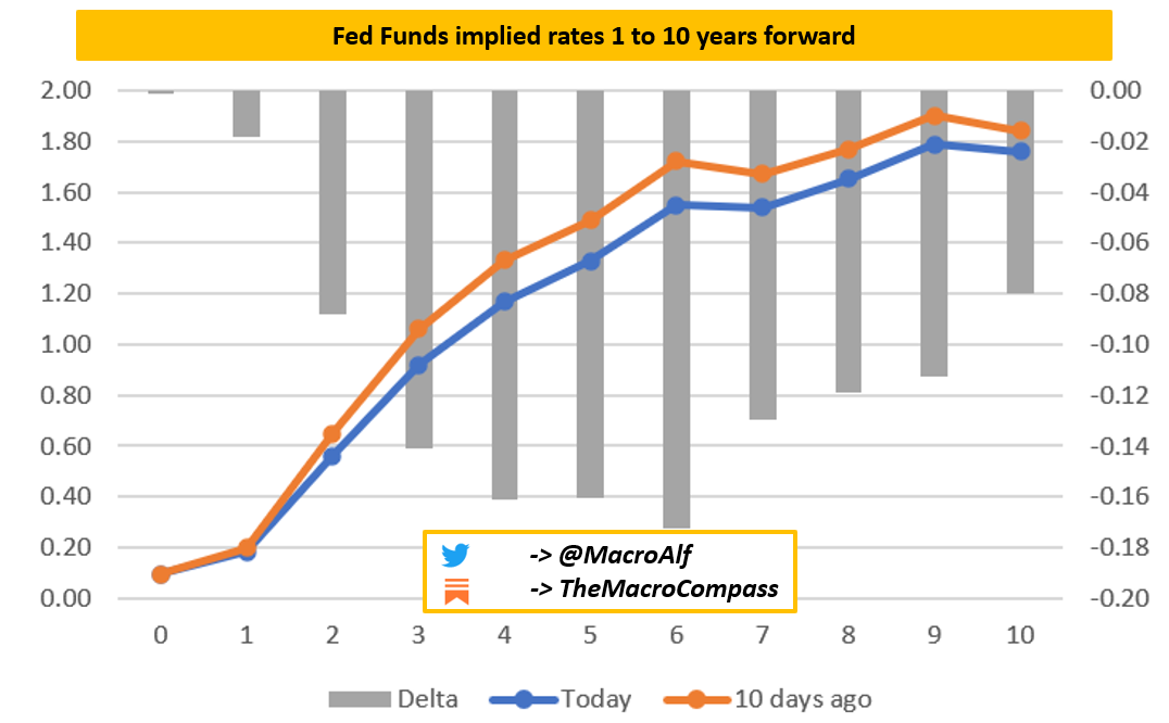
But the bond market did plenty of hard work in repricing the Fed Funds future path accordingly. The chart below shows Fed Funds rate 1y, 2y, 3y…10y forward as priced by the forward OIS curve.
Compared to 10 days ago (orange line), the fixed income market has now repriced the Fed Funds rate in 2027 to be almost 20 bps lower.
10 days ago, the forward OIS market priced Fed Funds at 1.8% in 2027 while they price them at 1.6% today.
Also, investors now expect the Fed funds rate to be <1% in 2024.
That’s less than 4x25 bps hikes in 3 full years from today.
The bond market is doing a lot of hard work on behalf of the Fed: as nominal rates drop, real yields remain low despite inflation expectations slowing down and USD appreciation is somehow contained.
Will the Fed align or march ahead with their tightening plans?
A quick take on the Delta Variant
Few governments here and there have decided to bring back some restrictions to avoid runaway infection numbers due to the Delta variant - apparently, you can get infected also if you were already fully vaccinated.
I have been reading few alarmist commentaries about renewed lockdowns and ensuing broad risk-off price action. From my common sense perspective, those worries seem largely misplaced at this stage.
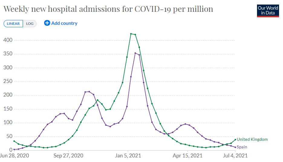
UK is now recording the same number of daily infections per millions of people they had during the 2020 winter wave. Those high infection numbers have been there for 2-3 weeks already. By now, we know hospitalizations lag reported cases and positivity rates by about 10 days.
You’d expect a large uptick in hospitalizations by now.
Nope.
Same story in Spain.
That’s good news: vaccines seem to be able to prevent 95%+ severe cases. So you might get infected with the Delta, but you won’t be nearly sick enough to require hospitalizations => little to no pressure on the healthcare system => no hard lockdowns.
New and more dangerous variants might arise, but given the set of information we have today I’d argue the alarmist commentaries are just…well, unnecessarily alarmist.
So, any trades?
I am looking into relative value trades that fit Quadrant 1, but also provide a decent risk/return and perhaps challenge some crowded positioning.
A while ago I entered a short Eurostoxx at 4.070 and closed it without any profits or loss after a couple of weeks.
That was not a smart trade setup: I needed a peek into Quadrant 4 to achieve decent P&L while my base case was that we were moving towards Quadrant 1.
A much better risk/reward expression of that trade would have been a relative value trade: long Nasdaq, short Eurostoxx. Basically a long growth/short cyclical trade with a EUR/USD short embedded into it (my base currency is EUR).
Reminder: this is NOT investment advice. The above has to be interpreted as a public journal for a fictitious, paper portfolio. I always represent myself and not my employer.
If we stay in Quadrant 1, the trade is likely to perform.
If we move to Quadrant 4, both legs are going to suffer but Nasdaq is likely to hold better due to the long duration nature of its components against the cyclical nature of Eurostoxx and the embedded EUR/USD short.
I am now looking into decent risk/reward, good entry levels relative value trades that fit Quadrant 1. Any hints?
If and when I trade, you will receive a trade alert in your inbox with entry, size, stop loss and first profit target. Maximum transparency.
Reminder: I only represent myself in this newsletter and not my employer. Trades might refer to the active management of my private account or to a fictitious paper portfolio. If I trade something, it does not mean you should do the same. Treat trade alerts as my own (fictitious or private account) trading journal, basically.
I hope you enjoyed this article!
If you did, I’d really love if you could share it on your social media.
At the end of the day it’s free (and hopefully valuable) content.
Thanks and see you soon!



Nice work. May I ask where you source the credit impulse data from? I look at FRED and watch loans and leases, commercial loans, and margin loans (other, non-MBS).
If the fed is pegging FFR at 0% and inflation is 2%, the real FFR is -2%. But is this not a tightening rather than loose monetary policy?
The fed is holding the FFR artificially high.
BTW, love your stuff. Thank you for posting it.