‘‘What we need to see is inflation coming down in a clear and convincing way, and we’re going to keep pushing until we see that: we clearly have still a job to do when it comes to cooling down demand’’
Jerome Powell, May 17th 2022
Powell’s remarks in the Wall Street Journal interview this week were quite interesting, and markets seem to have noticed: we have seen quite some wild moves, but again the most relevant price action is happening under the surface.
In such a choppy market environment, systematic risk management techniques and a data-driven investment approach are key to tell the forest from the trees and reduce drawdowns in your portfolio.
In this article, we will:
Reflect on some interesting market moves happening under the surface;
Discuss two of my macro ‘‘polar stars’’ indicators that can help us navigate and explain current market circumstances;
Introduce for the first time my Volatility Adjusted Market Dashboard (VAMD), a tool I’ve been working on to further deliver value to The Macro Compass community.
The Macro ‘‘Polar Stars’’ Indicators
Actually, before we jump right in.
Andreas Steno and I have been putting quite some effort to deliver the most fun and actionable macro investment podcast out there, and so far the response has been huge: almost 50.000 unique listeners per episode across platforms!
If you haven’t yet listened to The Macro Trading Floor podcast, this week is your chance: Andreas and I interviewed a very special guest and trust me, you don’t want to miss this! :)
Links here: Apple, Spotify, Google, YouTube.
Please also consider subscribing to the show on your favorite podcast app so you don’t miss any new episodes, and help us spread the word if you like the podcast!
Back to it: Powell played the hawkish horn again, and markets are reacting in quite some interesting ways.
The three main lines from his interview were:
‘‘Financial conditions overall have tightened significantly.
That’s what we need to see’’;‘‘We need to see growth moving down from very high levels, and we clearly have still a job to do on cooling down demand’’;
‘‘If that involves moving past broadly understood measures of neutral rates (i.e. 2.00-2.50% on Fed Funds), we won't hesitate to do that’’.
You gotta admit he can’t be more straightforward than this.
The FOMC is totally comfortable (!) with financial conditions tightening, as we clearly still (!) have a job to do on cooling down demand and if that involves raising Fed Fund rates >2.50% we won’t hesitate (!) to do that as we need to see is inflation coming down in a clear and convincing way (!).
But now, why would I define market reactions as ‘‘interesting’’?
We all see the consequent bloodbath in equity markets and it doesn’t strike as particularly surprising, right?
Well, here are a couple of interesting moves going on beneath the surface.
After a relentless move up, for the first time this year US implied real yields between 2027 and 2032 (5y5y forward) have experienced a remarkable drop.
But wait a second, I thought a tighter monetary policy stance would push real yields up via a combination of higher nominal rates (reflecting the new, hawkish stance) and lower inflation expectations (as markets expect Central Banks to be successful in this exercise)? Also if real yields are lower, shouldn’t that support risk assets?
Let me help you understand what’s going on.
Real yields are now responding to markets repricing demand down in a significant way: let’s have a look at commodities and GDP/earnings revisions for example.
Since the pandemic-related trough in 2020, Agricultural Commodities (Invesco DBA ETF, blue) and Industrial Commodities (copper, in orange) have basically moved up in sync: as the gargantuan amount of fiscal spending fed through the economy and supply bottlenecks were popping up, the demand/supply imbalance kept growing and supported price increases across the entire commodity space.
But now look at the divergence in that red box.
Over the last month copper - a bellwether metal for the global economy - has been hit with a 12% drawdown while Agricultural Commodities are trying to test new highs.
The rather global-industrial-demand-driven commodities (orange) have started to show signs of weakness against the more supply-bottleneck-driven commodities (blue).
Additionally, credit spreads are kinda blowing up with US high-yield spreads having now exceeded the 2018 peak of 500-ish bps and they seem to be heading towards the 600 bps 2016-global-growth-scare level.
Alright, so this must be reflected in GDP and earnings forecasts too, right?
I mean, Wall Street analysts and us on The Macro Compass must be looking at similar screens and charts after all :)
Analyst consensus for the 2022 US real GDP growth has been consistently revised down this year and now sits at 2.7% - but still nicely above trend, though.
And while even big consumer staples companies (e.g. Walmart, Target) have missed their earnings per share target and have warned investors they could actually deliver negative (!) YoY EPS in 2022, analyst consensus for 2022 EPS growth for the companies listed in the S&P500 index still sits at +10%.
Yes, plus 10%.
So, while forward-looking markets are pricing in a slowdown in demand it seems analysts are still relatively relaxed about the end point - shall we be, too?
Some of my ‘‘polar stars’’ macro indicators disagree.
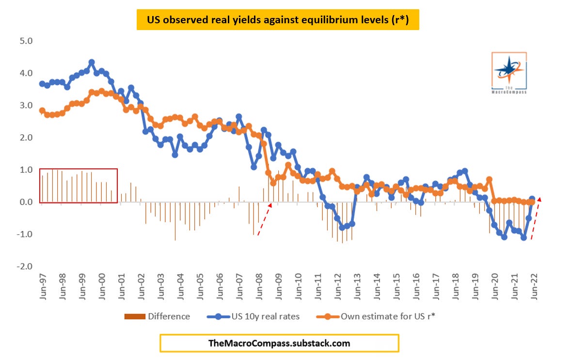
Real yields are moving up for the wrong reasons, and they sit above long-term equilibrium levels = not good.
Despite the sell-off, my equity risk premium metric says stocks are neither cheap nor expensive on a long-term basis and there seems to be more room to reprice further down.
Real yields can move up and down for good and bad reasons.
Up for good reasons: cyclical economic growth is picking up, and there are some expectations that long-term structural growth might be increasing too (e.g. 2017-early 2018);
Up for bad reasons: monetary policy is been tightened aggressively in an effort to cool things down, and cyclical economic growth isn’t that strong anymore (e.g. late 2018, early 2022);
Down for good reasons: monetary policy is been eased strongly and economic growth has bottomed and now picking up (e.g. second half of 2020);
Down for bad reasons: a major growth scare is coming and earnings/growth needs to be repriced down (e.g. 2016, perhaps now).
As we move back and forth between ‘‘up for bad reasons’’ and ‘‘down for bad reasons’’, my polar macro star indicator instead focuses on the observed real yields relative to long-term equilibrium real rates the economy can handle.
In the chart above I used 10y real rates to get a longer data history, but the main conclusion remains the same: when observed risk-free real yields (blue) either trade above equilibrium level (orange) for a prolonged period of time (red box) or they sharply reprice up in a short time frame (red arrow), s**t happens in markets.
Today, a blend of metrics I use to grasp US observed real yields is trading above equilibrium r* and - most importantly - the repricing from negative real rates to today’s positive and above-equilibrium levels has been extremely quick: not good.
But now, equity market valuations must be attractive after this repricing, right?
Not really.
Let me quickly introduce my simple gauge of Equity Risk Premium.
Investors always have a choice between allocating capital in a risk-free instrument or in risk assets - for which they expect to be compensated: hence, looking at S&P500 valuations in a silo makes little sense.
Instead, the focus should be on what's the additional expected return one can generate on top of the risk-free real yield she can get from investing in US Treasuries.
The 12-month forward earnings yield allows me to discount expectations for future earnings growth and zoom in on the valuation side, which I compare to 5y5y real yields: why?
Large-cap companies generally have a decent pricing power. That allows them to incorporate most of the inflationary pressures into earnings without hugely affecting margins, which is why one might consider their future cash flows as ''real'' cash flows to a certain extent.
Looking beyond just the next 5 years and hence focusing on 5y forward, 5-years real rates allows me to avoid focusing too much on the short-term monetary policy cycle: after all, we are trying to judge whether valuations are cheap/expensive from a medium to long-term standpoint.
At a 5.3% ERP, we are just sitting in the middle of a 15-year band.
Not cheap.
The main message hasn’t changed a tiny bit.
Stay.
Defensive.
The Volatility Adjusted Market Dashboard (VAMD)
I wrote too much about markets and macro indicators, but I still want to quickly introduce you to one of the many new tools you are going to be seeing on The Macro Compass in the near future: the VAMD.
This dashboard standardizes daily, weekly and monthly market moves in global macro (literally every-single-asset-class-and-geography) for the underlying volatility: the idea is that if Bitcoin moves 3% in a day I shouldn’t jump off my chair, but if EUR/USD moves 3% in a day I should really pay attention.
So, here you go with a preliminary release of the ‘‘summary dashboard’’ with a monthly time frame.
Developed and emerging market rates, equities and credit spreads plus commodities, FX and crypto all in one sheet and color-coded according to how ‘‘big’’ was the move.
For instance, over the last month we had a huge move in the ECB deposit rate priced by December 2022 (dark red = 3+ standard deviations) and big moves down in US equities, wider credit spreads, silver, copper, USD/RUB…
Did you think the BTC and ETH moves were huge?
Think twice: in standard deviation terms, nothing to be uber-impressed about…
Enough for today, guys.
Next Monday I’ll be explaining how I use the VAMD, what risk management techniques I use to size positions and limit drawdowns in my portfolio and the other tools we are working on to deliver even more value to The Macro Compass community.
If you have any suggestions or comments, please let me know!
Last but not least: if you are interested in any kind of partnership, sponsorship, or in bespoke consulting services feel free to reach out at TheMacroCompass@gmail.com.
Thanks for reading all the way through, you are my hero! :)
May I ask you to be so kind and click on the like button and share this article around, so that we can spread the word about The Macro Compass? It would make my day!
For any inquiries, feel free to get in touch at TheMacroCompass@gmail.com.
For more macro insights, you can also follow me on Twitter and Linkedin.
Feel free also to check out my new podcast The Macro Trading Floor - it’s available on all podcast apps (Spotify, Apple, Google, YouTube).
See you soon here for another article of The Macro Compass, a community of more than 47.000+ worldwide investors and macro enthusiasts!


Share this post