
‘‘My early blackjack career taught me several things. The first is that if you apply yourself with a lot of hard work and mathematical prowess you can beat the system.’’
Bill Gross
Understanding the bond market is paramount important to achieve that clear macro big picture most investors strive for when designing their investment portfolios: the Bond Market 101 Series is my best attempt to help you unpack and navigate fixed income markets, in plain English.
This is the third article of my Bond Market 101 Series.
You can find the first two pieces here (general intro) and here (breakdown of nominal yields into real yields and inflation expectations).
Today, we will answer the following questions:
Risk-free rates and Overnight Index Swaps (OIS): what are they, and why do they matter?
Should you look at the Treasury yield curve or the OIS curve shape? And which tenors should you focus on, and why?
Also, I will share with you a website where you can find live quotes for an instrument that can be considered a good proxy for the OIS curve!

Without further ado, let’s jump right in!
Treasury curve? OIS curve? 2s10s? 5s30s? Help!
Actually, before we jump right in.
If you’re struggling to keep up with all the good macro newsletters out there, I get you.
But the guys at Harkster.com have a handy solution: they created a fantastic, free newsletter aggregator that allows you to keep track of the ones you like, and find brand new ones to read.
I am using Harkster myself: you can even check out which newsletters I am reading!
Back to it: today, we will start digging into this bond yield decomposition:

In particular, we will focus on breaking government bond yields into a risk-free rate component and an asset swap spread.
I will use Treasuries to show how it works and why it is important, but this is applicable to basically any government bond out there.
In our monetary system, the closest proxy of a credit-risk-free investment would be parking cash overnight in local currency at your domestic Central Bank.
Central Banks are public institutions mandated and backed by governments to primarily make sure commercial banks can smoothly settle payments against each other’s at the end of the day.
They are also in charge of setting monetary policy to achieve price stability, but that’s irrelevant if the interbank payment system is impaired.
Effectively, placing money at a Central Bank would be tantamount to an overnight deposit at the government-backed clearing house for all commercial banks.

Alright, this sounds pretty much credit-risk-free.
But can I compare a 10-year Treasury yield to an overnight Central Bank deposit rate? No.
And do we know in advance what will be the overnight Central Bank deposit rate for every day over the next 10 years? Also not.
So, is there a ‘‘yield curve’’ that reflects the term structure of overnight Central Bank deposit rates over time?
Yes: the Overnight Index Swap (OIS) curve.
The 10-year US OIS rate for instance reflects market-implied expectations for the Federal Fund rate overnight path over the next 10 years.
That’s because a 10-year Overnight Index Swap contract implies a counterparty agreeing today to receive a fixed 10y rate and in exchange committing to pay overnight the prevailing Federal Fund rate for the next 10 years.

Today, market participants are finding a clearing price for a 10-year US OIS trade at 2%: roughly, it means the market-neutral expectation is for Fed Funds rate to ‘‘average’’ around 2% for the next decade (I know, discounting matters; but please allow me this simplification for now).
So, assuming you had a bank account directly at the Fed your 10y credit-risk-free investment would be expected to yield roughly 2% per year.
Before we touch upon the difference between OIS rates and Treasury bond yields, a quick word on the shape of the US OIS curve and why it matters.
If you haven’t read it here few months ago already (sometimes I get it right!), you must have recently heard that ‘‘curves are inverting’’ - everybody talks about the Treasury yield curve, but what are OIS curves telling us and which tenors to use?

The chart above shows three often-mentioned curve shapes:
30y vs 5y (blue);
10y vs 2y (orange);
10y vs 3m (grey, dotted line).
As you can see, both the 30y vs 5y and 10y vs 2y OIS curve shapes are basically trading at 0 bps today - actually, the 5s30s curve has inverted a few times already since February.
The 10y vs 3m curve on the other hand is trading way off inversion and it’s actually even steepening.
How come, and which one to focus on?
Curve inversions are relevant because they signal borrowing conditions for the real economy agents are getting too tight (higher front-end yields) against the equilibrium borrowing rate they can afford given their structural capacity to generate earnings to service their liabilities: these drivers are instead reflected in long-end rates.
10-30 years is considered to be a long enough time horizon for structural factors to have an impact on potential GDP growth and long-term inflationary pressures: changes in demographics, productivity, technological trends, debt levels and other structural drivers are therefore reflected in long-end rates.
I marked the US 30-year bond yield chart below for all the most famous ‘‘regime changes’’ narratives which have populated headlines since the ‘90s: the most recent being the 2010 ‘‘QE = hyperinflation’’, the 2013 ‘‘taper tantrum’’ and the 2018 ‘‘bond yields will go to 5%+ again’’.
In reality, long-end bond yields never really departed from their secular downward trend whose drivers are (mostly) listed above.

But what’s the time horizon instead for ‘‘short-term’’ monetary policy conditions?
The most recent hiking cycles have lasted on average around 2-5 years (1986-1989, 1994-2000, 2004-2007, 2015-2019) and traders’ expectations are therefore reflected in 2 to 5 years OIS rates.
3 months OIS rates are not a good indicator as they fail to incorporate the average length of a reasonable hiking cycle, and therefore can only move up once Fed Funds rates have been already increased: basically, it’s a lagging indicator.

Ok, let’s say I convinced you to look at 2s10s and 5s30s OIS curve shapes.
Where the heck do you find these data, and why can’t you just look at Treasury yield curves instead?
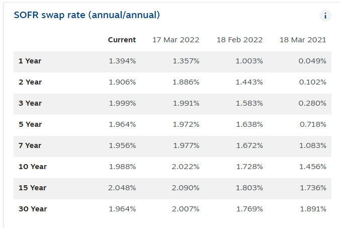
OIS swap rates are only available if you own a Bloomberg terminal (at least to my knowledge), but I found a good solution for you guys!
This website regularly updates SOFR swap rates: it’s not the same as OIS, but it’s the cleanest dirty shirt you can find after Overnight Index Swaps.
To make it simple, SOFR swap rates are mostly based on Treasury repo transactions.
A collateralized overnight repurchase agreement with Treasury bonds as collateral hits very close to home when it comes to credit-risk-free transactions: unless there are major problems in the repo market, this should be a decent proxy for the OIS curve.
Ok, but I still haven’t told you why you can’t simply look at 5s30s Treasury yield curve shape instead: let me do it with one chart.

Treasury yields are higher than OIS rates, and the difference (called asset swap spread or swap spread) becomes pretty significant at longer tenors: this increasingly bigger gap makes the 5s30s US Treasury curve look ‘‘way steeper’’ than the 5s30s OIS curve.
Today for instance:
The 30y-5y slope in US Treasuries is +25 bps (still upward sloping)
The 30y-5y slope in US OIS rates is -2 bps (already inverted!)
Not a negligible difference.
Using Treasury yield curves instead of OIS curves and focusing on the wrong tenors to assess the curve shape are frequent mistakes that unnecessarily pollute the yield curve inversion analysis.
Conclusions
Overnight Index Swaps (OIS) can be thought of as the cleanest ‘‘yield curve’’ out there: they solely reflect the term structure of market participants’ expectations for the path of the Federal Fund rates over time.
As the average hiking cycle historically lasted between 2 and 5 years while structural factors influencing long-term equilibrium borrowing rates take decades to unfold, we have identified the slope between 2y-10y and 5y-30y OIS curves as two handy curve shapes to track to grasp the bond market assessment of where we stand in the cycle.
Also, we discussed why OIS rates can be considered amongst the purest (credit) risk-free investments in today’s monetary system and showed that Treasury yields are generally higher than OIS rates and Treasury yield curves steeper than OIS curves…
…Wait a second, though.
If a local currency deposit at the Central Bank is considered to be THE credit-risk-free investment as governments mandate and back these institutions to be the clearing house of commercial banks and set monetary policy to achieve price stability…
…buying a local currency government bond should be considered at least as credit-risk safe, right?
In theory, yes. Indeed.
So, why do Treasuries yield MORE than the corresponding tenor OIS rate?
In other words, why are asset swap spreads meaningfully higher than 0?
In short: regulatory and balance sheet constraints.
Stay tuned for my next Bond Market 101 Series article, in which I will make sure to unpack this strange animal called asset swap spreads!
Thank you for making it all the way through! :)
If you enjoy my work, I would really appreciate if you could click on the like button at the end of the piece and share the article in your network.
If you are interested in any kind of partnership, sponsorship, or in bespoke consulting services feel free to reach out at TheMacroCompass@gmail.com.
For more macro insights, you can also follow me on Twitter and Linkedin.
See you soon here for another article of The Macro Compass, a community of more than 33.000+ worldwide investors and macro enthusiasts!