‘‘Nothing so weakens a government as inflation’’
John Kenneth Galbraith
The latest US inflation report was all but portraying a benign slowdown in inflationary pressures.
On the contrary, the less distorted month-on-month measures showed a pickup in CPI and most importantly the composition of such inflationary pressures is quickly broadening towards the stickiest components of the CPI basket.
What many market commentators don’t fully appreciate is that a deceleration in inflationary pressures is not enough for the Fed to take the foot off the gas pedal: the momentum and the composition of such slowdown against the FOMC’s expectations will be the most important drivers behind the Fed’s reaction function in 2022.
In this brief article, we will:
Look behind the curtain of the latest CPI report, and assess what happened to the momentum and the composition of inflationary pressures;
Reflect on the ‘‘what if’’ question: what if inflationary pressures remain stickier than the Fed expects? How would their reaction function look like?
Discuss what probability Mr. Market assigns to this ‘‘what if’’ scenario by having a deep look at the fixed income market.
Without further ado, let’s jump right in!
Let’s Look Behind The Curtain
Actually, before we jump right in.
If you are interested in any kind of partnership, sponsorship, or in bespoke consulting services feel free to reach out at TheMacroCompass@gmail.com.
Back to it: the US CPI report which came out yesterday showed inflation is moving towards the stickier components in the basket and the pace of the slowdown might actually disappoint the Fed’s expectations.
While most of the headlines focused on ‘‘Core CPI slowed down to 6.2% YoY in April’’, a more nuanced look to the CPI report provides with some more interesting details that conflict with this simplistic thesis.
In particular:
Month-on-month core inflation accelerated to 0.6%, beating all the 67 estimates in the Bloomberg economists’ survey;
Core services prices rose at their fastest monthly pace (+0.7%) since 1990;
For core inflation to slow towards 4% by year-end (Fed’s own expectation), the next 8 monthly prints need to come in below 0.15% against the realized average MoM print of 0.50% so far in 2022.
In the latest press conference, Powell was often referring to month-on-month inflation rather than the yearly change: I agree with him there, as the base effects from early 2021 can easily distort the YoY analysis - think about the crazy swings in used car prices for example.
Well, month-on-month core CPI accelerated to 0.6% and the composition of such acceleration doesn’t look friendly either for the Fed.
Inflationary pressures are moving from the pandemic-related supply and demand imbalances in durable goods (blue) to the stickier services categories (orange).
The Fed’s delay in withdrawing accommodative policies has allowed inflation to seep into stickier services categories -- even as many goods prices are starting to decline.
What’s worse is that the pace of this pickup in core services prices is the fastest we’ve ever experienced in over 30 years - however you slice and dice it (MoM, YoY).
But what’s driving such a sharp acceleration in the sticky core services prices?
Apart from the big print in airline fares (+19% MoM) which contributed by about 0.1% to the upside surprise in core inflation, the lion share of the pickup came from shelter inflation.
The chart below shows the contribution of Owners’ Equivalent Rent & Rent of Primary Residence to the overall CPI prints over time: it’s quickly becoming a significant component of inflationary pressures.
As house prices dramatically increased and nominal disposable income levels were supported by the C-19 related fiscal transfers, measure of Owner’s Equivalent Rent started moving up (and more aggressively so after rent moratoria waned).
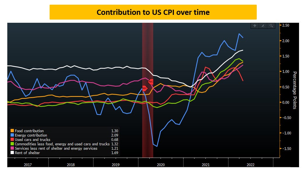
Here is another way to visualize the contribution to CPI over time:
The contribution from the volatile ‘‘used cars and trucks’’ (red line) and commodities (green) has been moving down while rent of shelter (white) has significantly gone up.
This explains why the Fed has been so adamant in engineering higher mortgage rates.
It will inevitably slow demand for houses, which achieves two objectives at once for them: it slowly helps achieving the ‘‘reverse wealth effect’’ and it also lowers shelter inflation via second round effects.
The global real estate market is by far the biggest asset class in the world, and it hence represents a big contributor to the wealth effect we’ve experienced over the last 40 years: more leverage at cheaper borrowing costs = higher asset prices = to some extent, more buoyant attitude towards spending.
By cooling down the housing market, the Fed is trying to reverse this wealth effect.
As they slowly work towards achieving this, with a lag also shelter inflation will slow down contributing to their objective to lower inflation.
But now, what could this mean for the Fed’s reaction function?
And what does Mr. Market think of such ‘‘what if’’ scenario?
What If?
So, let’s entertain for a second the thought that inflation will slow down much less than the Fed expects and that the endpoint is going to be higher than 2% as price pressures broaden to the stickier categories as discussed.
After all, for core inflation to slow to around 4% by year-end (Fed’s own estimates, see here), MoM prints need to slow down to around 0.15% from the current 0.6% and the year-to-date average of 0.50% - not a walk in the park.
How would the Fed have to react?
In one line: in a convex way, making sure to position themselves way ahead of the curve to send a very, very convincing signal to markets and consumers.
Over the last decade, we have been conditioned to think of Central Banks’ reaction functions in a linear fashion.
Inflation (expectations) decelerate below 2%, Central Banks ease.
Inflation (expectations) accelerate above 2%, Central Banks tighten (ok, that was rare).
Always in a proportional, measured way.
But when core inflation remains too high for too long, price pressures are broadening and inflation expectations are at risk of upside de-anchoring…f*ck the linear reactions.
Policymakers have a clear incentive scheme: keep inflation and inflation expectations around 2% and predictably adjust policy to get there.
But when you dangerously move towards the tails and stay there for too long, your reaction becomes much more than proportional: the strongest asset for a Central Bank is their credibility and forward guidance, and you just can’t allow to compromise on those.
So, what’s the probability Mr. Market is assigning to a convex reaction from the Fed?
The easiest way to grasp this is to look at the what traders are pricing inflation (expectations) to be and the implied probability that Fed Funds rates will be much higher (say at 5%) in one year from now.
On the inflation front, while 1y inflation swaps are at 5% (!) here is how traders price in the inflation expectation forward curve by Jun-2023.
1y1y means inflation expectations for the Jun23-Jun24 period; 1y2y means inflation expectations for the Jun23-Jun25 period and so on.
So, strong average CPI prints over the next 12 months but then a downward sloping trend to levels below 3%: close to the ‘‘convex’’ point but with a friendly declining trend to ease policymakers’ minds.
The ‘‘what if’’ scenario in the inflation swap market is priced in with a medium-low probability.
When it comes to interest rates, we can easily assign a number to that probability by looking at the option market underlying the Eurodollar futures with expiry in Jun-23.
The chart above shows the payoff profile of a put spread on the Eurodollar Jun-23 future with strike as 95.25 and 95.00.
Sounds complicated, but it’s not - bear with me.
By buying a bearish put spread with these strikes, you make money if the 3m Libor rates print at or above 5% by Jun-23 while you lose the option premium if you end up below 4.75% - the green line shows your P&L structure (P&L in $ cents on the right hand side of the chart).
The blue line shows the cumulative implied probability that rates are going to be above a certain %, and it’s calculated by looking at how much premium you spent to buy this put spread against how much payoff you make if you are right on your bet.
In our case, this structure costs around $0.03 and the payoff is around $0.25, which roughly means there is a 12% cumulative probability priced in that 3m Libor rates will be at 5% by June 2023.
Not much ‘‘what if’’ scenario priced in.
Conclusions
While the base case remains that inflationary pressures are slowly going to dissipate the latest CPI report shows price pressures are broadening towards the stickier components of the inflation basket.
Policymakers’ reaction function to higher or lower inflation expectations tends to be mostly linear, but it could quickly becomes convex once you approach certain ‘‘unacceptable’’ thresholds: the bond and the inflation swap markets are pricing a low probability of such non-linear reaction functions at this stage, but the ‘‘what if’’ question remains an important one to monitor.
In the meantime, remaining defensive on risk assets as suggested here on The Macro Compass since December 2021 will likely prove to be the less disruptive choice for our portfolios and purchasing power.
Last but not least, a new episode of The Macro Trading Floor podcast is out!
This week, Andreas Steno and I interviewed Saxo Bank’s CIO Steen Jakobsen and his macro thesis and trade idea were extremely interesting considering he was around in the late ‘70s and hence traded for real the last proper inflationary spike.
Links here: Apple, Spotify, Google, YouTube.
Thanks for reading all the way through, you are my hero! :)
May I ask you to be so kind and click on the like button and share this article around, so that we can spread the word about The Macro Compass? It would make my day!
For any inquiries, feel free to get in touch at TheMacroCompass@gmail.com.
For more macro insights, you can also follow me on Twitter and Linkedin.
Feel free also to check out my new podcast The Macro Trading Floor - it’s available on all podcast apps (Spotify, Apple, Google, YouTube).
See you soon here for another article of The Macro Compass, a community of more than 45.000+ worldwide investors and macro enthusiasts!


Share this post